PORTLAND, OR – On Feb. 14, Cascade Brewing will launch Sang Du Chêne, its first bottle release to feature a newly redesigned label and logo. Meaning “blood of the oak,” Sang du Chêne features sour strong blond and triple ales aged in three large format oak vessels: foudres, puncheons and hogsheads. The oak influences provide flavors of toasted sugars, vanilla and spice, complemented by the bright acidity and fruity character of the beer.
Cascade has unveiled three distinct label formats, one for each of the three tiers of products it produces. The three tiers are based on the ingredients used in the beer, the time the beer is aged in the barrel, and the type of barrel used – all of which establish the pricing tier of the project.
The new graphics will be on all subsequent releases throughout the year; each beer within the tier will have its own color to delineate between brands. Sang du Chêne will be the first Tier 2 to be released, while Kentucky Peach (set to release in early March) will be the first Tier 3, followed by Apricot in April, which will be the first Tier 1. 
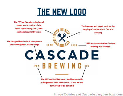
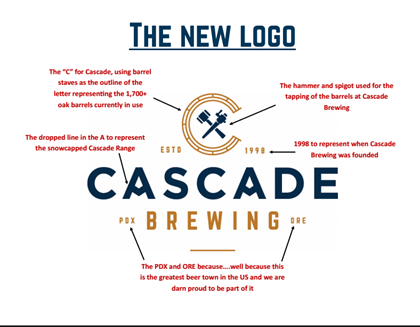
In addition to the labels, Cascade has unveiled a restyled logo, already seen by many on its social media channels. According to Tim Larrance, vice president of sales and marketing, “The new logo was incorporated to represent who we are and what we do at Cascade. The C logo is shaped with barrel staves to pay homage to our barrel aging process (no kettle sours here). The crossed hammer and spigot represents the tools used for the tapping of the barrels, while the dropped line in the A in Cascade reflects the snowcapped Cascade Range where our name comes from. In addition to adding the year we were founded (1998), we have also included PDX and ORE because we are incredibly proud to be from this city that is home to some of the best beers and breweries anywhere in the world.” 
The new label and logos were developed by the team from Murmur Creative of Portland, as well as Kirsten Karkanen (granddaughter of the Cascade’s owner Art Larrance), who helped with the initial designs. 
“We are very happy with what the creative teams have come up with during this 6-month process & extremely excited to show our wholesaler partners, retailer and consumers the new look,” explained Larrance. “However, please know that we have only changed the outside; the wonderful barrel aged sour beer inside the bottle will remain just as good as ever.”


0 comments (click to read or post):
Post a Comment
Please leave a comment...I do moderate each comment so it may not appear immediately...and please be nice! You can also comment using Disqus (below) or even comment directly on Facebook (bottom).